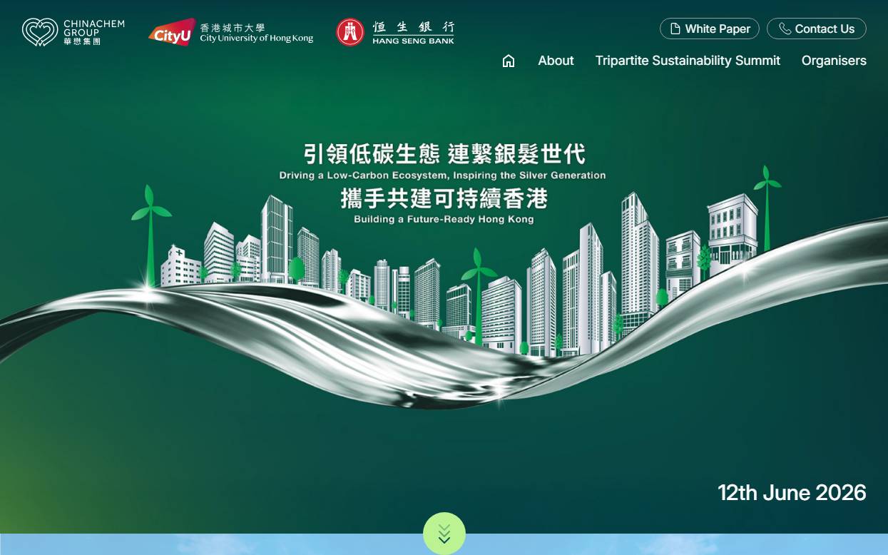
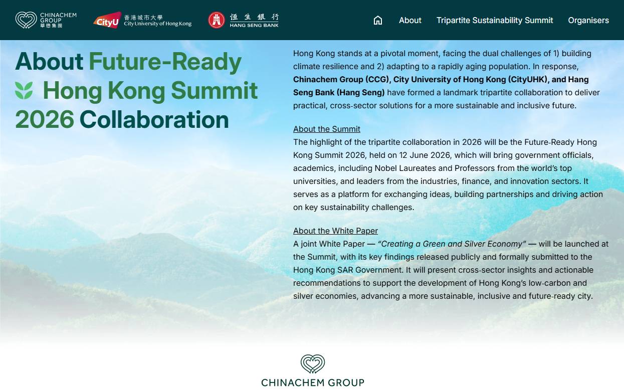
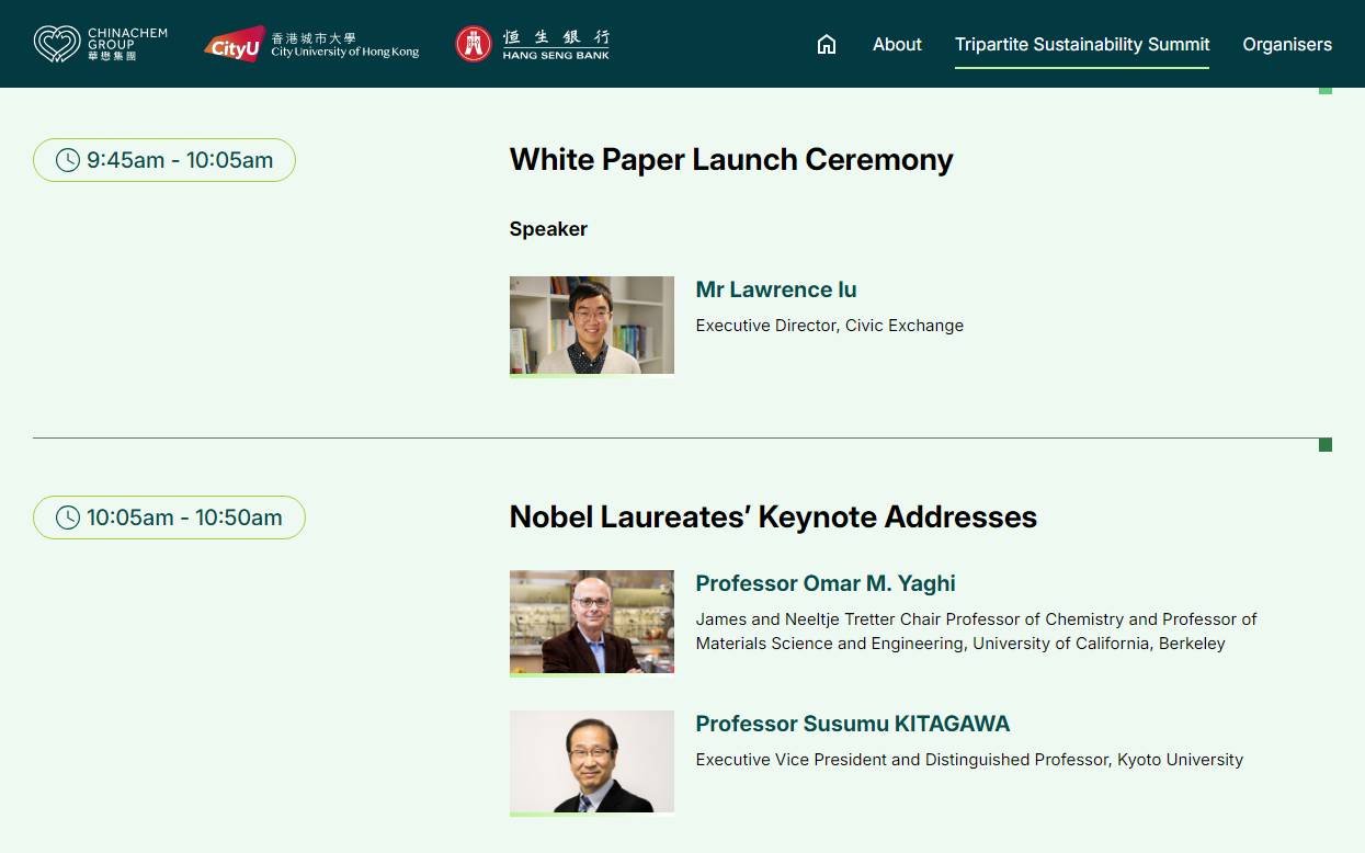
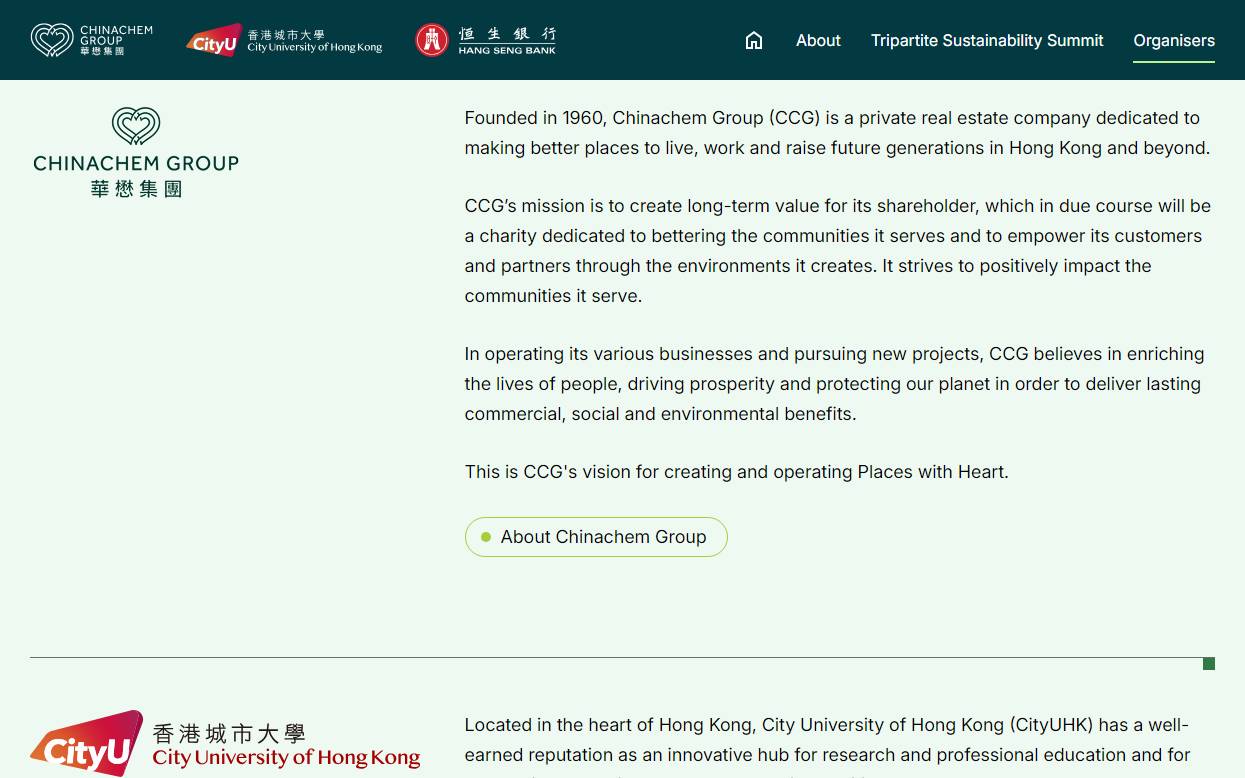
City University of Hong Kong Main Website
A refreshed responsive website experience for City University of Hong Kong, translating the university's visual identity into a distinctive digital system with clearer journeys, expressive media and consistent interaction across desktop and mobile.
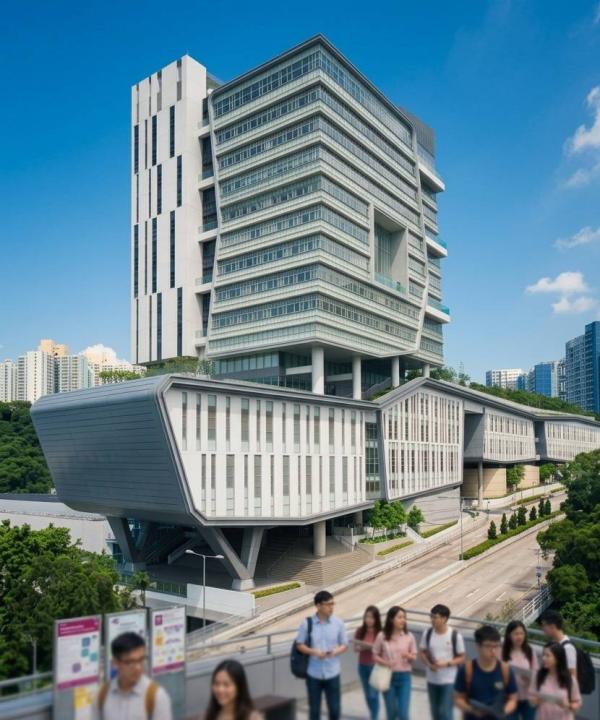
The challenge
Understanding the real problem
The university's main website needed to represent a large, diverse institution while remaining easy to explore. The design had to balance an energetic visual identity with clear access to academic and institutional information across many screen sizes.
The approach
Designed around people and operations
i2 developed the experience around the university's 'Free to Flow' direction, using the CityUHK logo geometry as a flexible grid. Navigation, typography, colour, imagery and motion were designed as one responsive visual system rather than isolated page treatments.
The solution
A system built to keep working
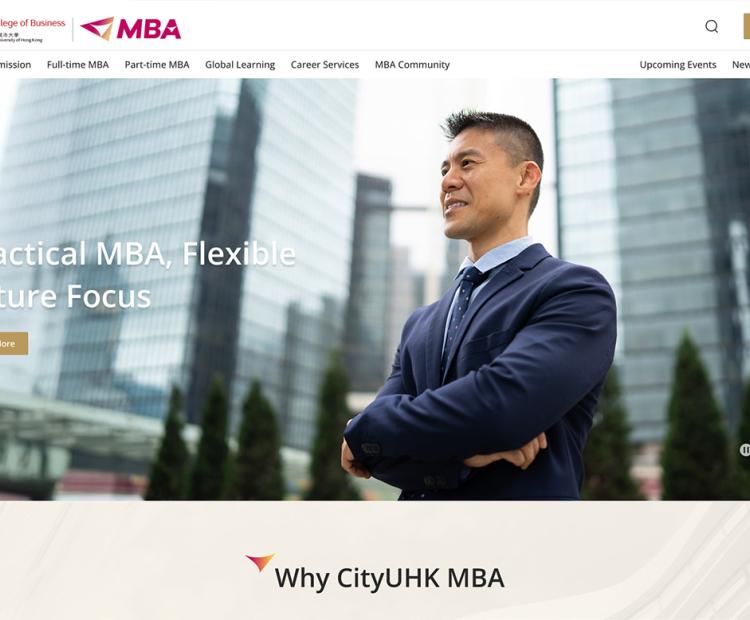
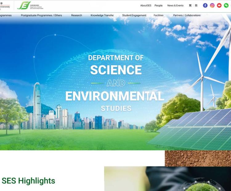
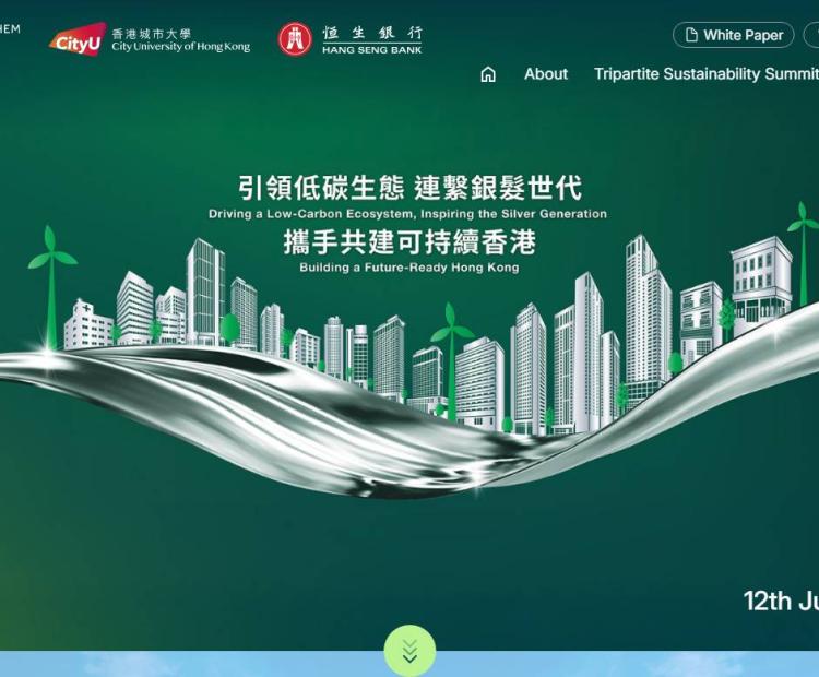
The refreshed interface combines a recognisable CityUHK visual language with responsive layouts, structured navigation, video backgrounds and considered interaction details, giving visitors a more coherent route through the university's content.
Identity-led grid
A flexible layout system draws from the geometry of the CityUHK logo to create a distinctive but consistent digital expression.
Responsive information journeys
Content and navigation adapt across desktop, tablet and mobile while preserving hierarchy and key actions.
Expressive interaction
Hover behaviour, smooth scrolling and video backgrounds add energy while supporting the wider user experience.
Unified visual language
Colour, typography and imagery work together to represent the university consistently across the main website.
Inside the work
Interfaces and moments that matter


Responsible delivery
Trust is part of the architecture
Accessibility and inclusion
Responsive layouts, clear hierarchy and consistent navigation patterns support visitors moving between desktop, tablet and mobile. Motion and media are used to reinforce, rather than replace, the information structure.
Case study Q&A
What organisations often ask
What was i2's role in the CityUHK main website project?
i2 provided UI/UX and responsive website design, translating the university's identity into a coherent digital experience.
How does the design reflect CityUHK's brand?
The visual system uses the geometry of the CityUHK logo as a flexible grid, supported by a vibrant palette, typography and imagery.
Does the experience adapt to mobile devices?
Yes. The layouts and navigation were designed responsively for desktop, tablet and mobile use.
How is motion used on the website?
Hover interactions, smooth scrolling and video backgrounds add expression while the underlying content hierarchy remains clear.
Connected expertise


 Contact Us Now